Last week, SUSU Rector Alexander Shestakov officially presented the University’s new brand platform to teachers and staff. The centerpiece of this presentation was a fantastic laser show, which did not leave a single person in the conference hall unimpressed. The new SUSU logo as a symbol of the university uniting Europe and Asia, was accepted by the students and staff with emotion and positivity, and some of them were brought to tears from admiration and pride for their alma mater.
Andrey Radionov, SUSU Vice Rector for Academic Affairs
The logo change was as timely as ever, because 1-2 years ago already some ambitious goals were set before the University as part of its participation in Project 5-100. According to the new path of development, the University should evolve to meet these goals, and the new logo and brand platform are directly tied to SUSU’s location in the environment. Where earlier we presented ourselves as the largest and best Russian university, now we are entering the international level and must be properly represented at the international academic arena as a leading academic center.
.jpg)
Leonid Sokolinskiy, SUSU Vice Rector for Informational Support
The presentation was wonderful; for the first time at the University they demonstrated new laser technologies which left a big impression on me, personally. In relation to the logo, I think that the new symbols represent, first of all, a renewal of our huge university. The logo demonstrates legacy – the shield, which existed in the previous logo, and the recognizable main building. The new elements – the gryphon and lion – symbolize the new global role of our University – to be not only a strong university for this region of the Russian nation, but an international level university which develops communications in the East and in the West.
.jpg)
Vadim Erlikh, Director of the SUSU Institute of Service, Tourism, and Sport
The new logo has a totally new meaning which allows us to think in an international way rather than the standard way that we are used to. The new logo and brand platform show that we are not standing in one place, not languishing, not going backward, but only forward, towards something grand and serious.

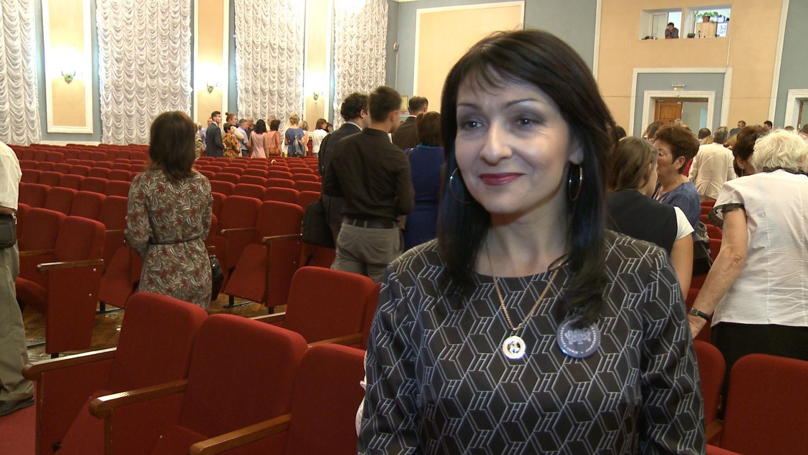
Elena Ponomareva, Director of the SUSU Institute of Social Sciences and Humanities
My impressions of this presentation were grand, and on the logo – the warmest. This logo has a symbol which I have loved for a long time. The gryphon guards the best cities in the world – my beloved Saint Petersburg, Venice, and you can see the gryphon in the architecture of the majority of Spanish cities. And the fact that we now have a gryphon in the SUSU logo – it’s great! The new logo brings together the past and future of the University. We will protect that which was already built and build a big future. I’d like to believe that the gryphon and lion are not just images, it is mythical powers that we are calling to aid us, and I think that they will definitely help us!
Elena Yaroslavova, Acting Director of the Institute of Linguistics and International Communication
A notable event has occurre d – we accepted a new logo which, in my opinion, was chosen very well, because it combines within itself some characteristics of the previous logo and new symbols which will help make SUSU recognizable not just in the region or in Russia, but abroad, as well. The lion and gryphon have a meaning of unifying Europe and Asia. Territorially, we are also located on the border of Europe and Asia, and we have always been proud of this. The logo contains assurances that we will be able to unify these two parts of the world and take a leading position on the international education market.

Kseniya Volchenkova, Head of the SUSU Department of International Languages of the Institute of Linguistics and International Communication
Over the summer, the University has done some very important and interesting work; I think that the changes to the logo were necessary in these conditions of internationalization that we live in today. It was necessary to think something up that could be understood by everyone: by researchers, by applicants and their parents, and by the students who are studying here now. The new logo reflects well the idea that SUSU, being located on the territory of the South Ural region, is some kind of meeting point between the two parts of the world – Europe and Asia. This logo is significant, because the university is evolving. And according to a few criteria we are even outperforming in these tasks that were set for us as part of Project 5-100. This is definitely a new stage in the life of SUSU, which in 10-15 years will be known not only in Asia but throughout Europe, too.
.jpg)
Nikita Kovalev, student of the SUSU Institute of Architecture and Construction
The logo is great – it brings together Europe and Asia; the large U in the center of the shield represents University, Ural, and Union all at the same time – this is cool and trendy. It is really great to study here at this exact time, when such changes are occurring at the University. I feel like some kind of pioneer – this is really inspiring!
.jpg)
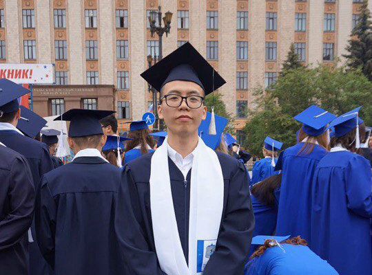
Baylian Tsin, SUSU postgraduate student
I think this is a very good logo which allows us to recognize the great history of our University. SUSU has high culture from both Europe and Asia. For me, as a person who has come from China, this is very important. Right now, I am far from my country, but the lion in the symbol, as a symbol of Asia, reminds me of my home and that it is close. I like this University because it has real history, and I think that there are many discoveries ahead now.
Roman Anoshko, SUSU graduate
There is a connection between the new brand and the University. The elements that are included in the logo very precisely reflect the University’s status: the University, in the form of the main building, being located between the lion and the gryphon, is a link between two cultures. For me, as a SUSU graduate, the future of the University is very important. It is nice to see that this University which is significant to me is not sitting in one place, but moving along with the times, utilizing modern technologies. I would like for the University to continue developing, progress in all areas, receive awards, and end up in the best world ratings.